|
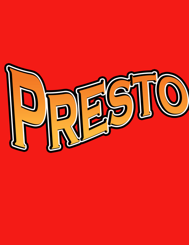
In this part of the course we are supposed to match the font. This first picture is a match to Presto, which is a disney pixar movie. There were different steps to doing this such as warping the text, fading the color of the text, and getting the black and white boardering of the text.
|
|
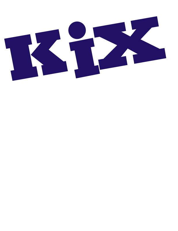
This text is a match of the cereal KIX. This was more of a simpler one. I just had to get the font correct, line the text up, and add a dot to the I (which is just a period).
|
